Charts are an important tool in the world of investing, used to show market dynamics and price changes. Traders and analysts use different types of charts because they make it easier to read market data and make more informed decisions.
Once you've set up your trading account, you'll need tools to help you uncover market insights and opinions in order to decide which trades to make. One of the most important tools in the world of investing is the colorful and engaging graphic representation of market movements called a "trading chart".
There is not just one type of trading chart, but several. Each type of trading chart has its own unique features, advantages, characteristics and uses. The most popular are candlesticks, bar charts and line charts.
Types of trading charts:
01. Candlestick Charts
What is a candlestick chart?
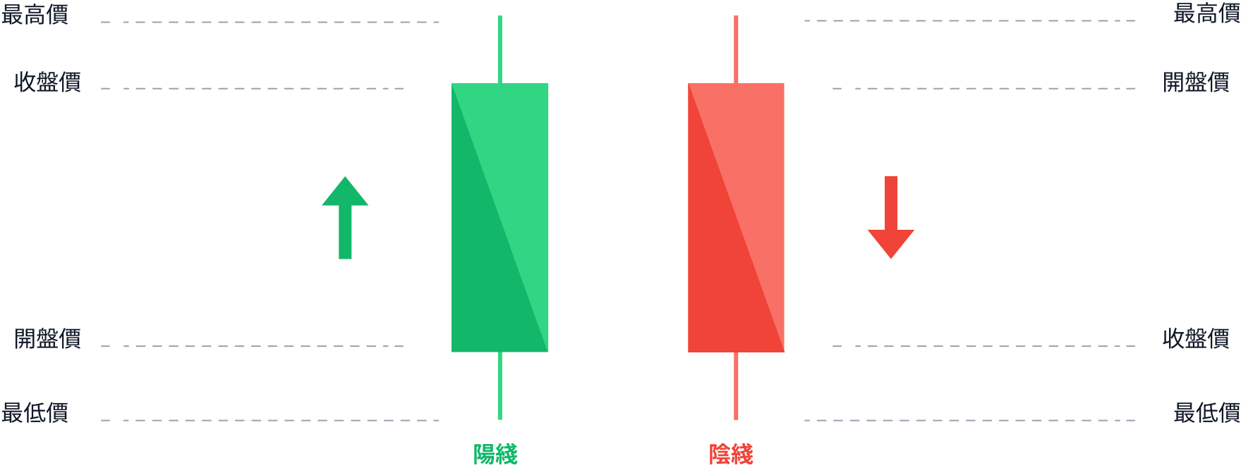
A candlestick chart is made up of rectangular bars with lines extending from the top and bottom of each rectangle, which looks like a candle with a "wick", hence the name. Candle shaped charts are used to track changes in the financial markets. These charts are easy to read because the top line represents the highest price of an instrument in a given time period, while the bottom line represents the lowest price. The rectangles themselves represent the opening and closing prices.
What are the benefits of a candlestick chart?
This type of chart is favored by many traders and investors. The reason is that they provide them with excellent market insights at a glance. By just looking at a candlestick chart, a trader can:
- Determine whether the market is bullish (up) or bearish (down):
It is easy to read a candlestick chart to determine the state of the market. In this type, the rectangle will tell you the change in the price of a particular instrument. The shorter it is, the smaller the price change. The longer it is, the greater the price change. - This type of chart makes it easier for traders to see the direction of the market:
The "candlestick" or "shadow" in a candlestick shaped chart indicates the highest and lowest price levels in a specific time frame. By referring to it, traders can determine whether an uptrend is part of a bullish trend or simply a bearish bounce. - Using this type of chart, they can quickly spot industry trends:
Unlike other types of charts, candlestick charts show a clear pattern of positive and bearish reversals.
02. Bar Charts
What is a bar chart?
Bar charts use rectangular bars to present data. Since the length of each rectangle is proportional to the value of the data it reflects, comparing data across categories is simple.
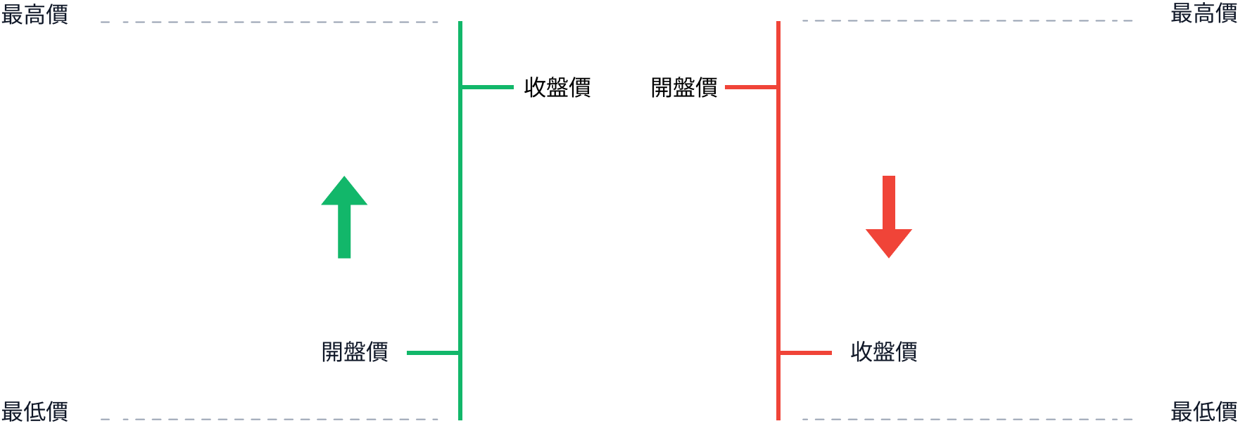
This type of chart is used to show the price movement of a financial asset over time. Each bar in the chart represents a different time frame, such as a day, a month, or a week. A bar chart shows the opening, closing, high and low prices for the period represented.
The top of the bar above the chart represents the highest price reached during the represented time frame. The bottom of the bar represents the lowest price. On the other hand, the small horizontal line on the left side of this type of chart represents the opening price, while the small horizontal line on the right side represents the closing price.
What are the advantages of bar charts?
- Bar charts are easy to read and analyze:
Since each bar represents a specific time period, price movements can be easily read using bar charts. - They help traders to identify key price points:
Because these charts show the open, close, high and low prices for each time period, they allow traders to quickly identify key price points and other important information such as support and resistance levels. - These trading charts are customizable:
Using bar charts, traders can monitor and track various time spans and time periods, which allows them to focus on market breakdowns and identify trading opportunities.
03. Line Charts
What is a Line Chart?
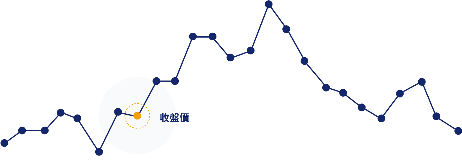
Folded line trading charts are used to show changes over a period of time. The time period is represented by a horizontal axis for time and a vertical axis for data values. Between these two axes, there are points representing the closing price of the asset and a line connecting these points.
What are the advantages of this type of trading chart?
- Identify trends and patterns in data over time:
Trends and patterns in data over time can be easily identified using line charts. In fact, they allow the user to see how the data has changed over time and identify any significant changes in the trend. - These charts are easy to interpret
Even a beginner can interpret the charts because they only show the closing price over a period of time. This makes them a popular choice for novice traders at the beginning of the trading world. - They are very useful for long term analysis
Polyline charts are particularly useful for analyzing long-term trends, as they help traders to identify major support and resistance levels over a long period of time.
Final Wrap-Up
Trading charts are a useful tool for displaying and interpreting data. Three popular chart types that beginners should familiarize themselves with are candlesticks, bars and line charts. Each type of trading chart has its own unique advantages that can help traders trade more effectively. They help them analyze data and market trends to make more informed trading decisions.